design
A collection of miscellaneous work of graphic designs: visual identities, logos, packaging designs.
visual id: Studio Williams
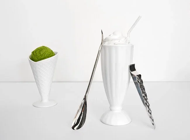
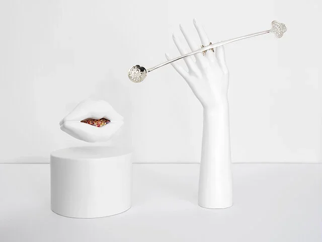
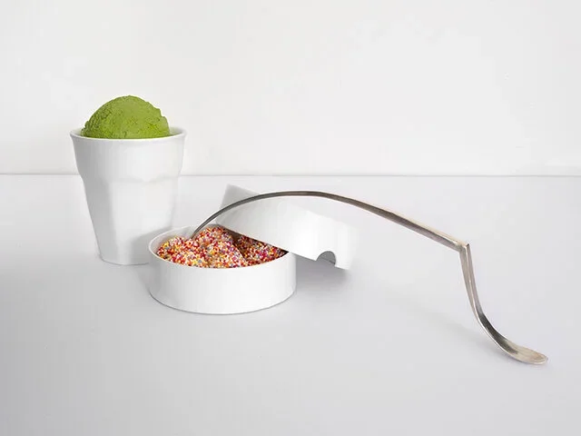
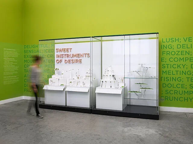
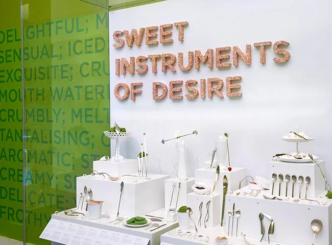
Studio William is a quintessentially English cutlery company, who specialises in creating innovative sensory forms. Studio William, led by William Welch, is an award-winning Industrial Designer.
From Number 10 Downing Street to the Sydney Opera House and the Burj Al Arab, Dubai, Studio William cutlery can be found at some truly breathtaking venues around the world.
design approach:
The rebranding project involved creating a cohesive and modernised visual identity, encompassing:
Logo: Creating a sleeker and more contemporary look.
Packaging: Developing premium and elegant high-end packaging designs.
Marketing Materials: Designing promotional events, ensuring consistency across touchpoints.
The visual identity incorporated refined typography, a neutral color palette, and subtle graphic elements to evoke quality and freshness. Each element was meticulously crafted for a premium market.


visual id: Sun Salat
project overview:
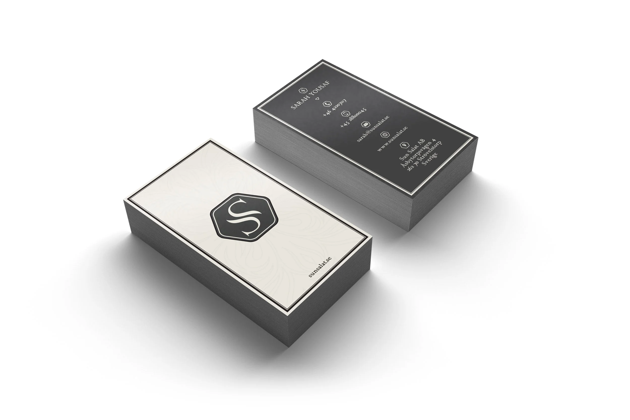
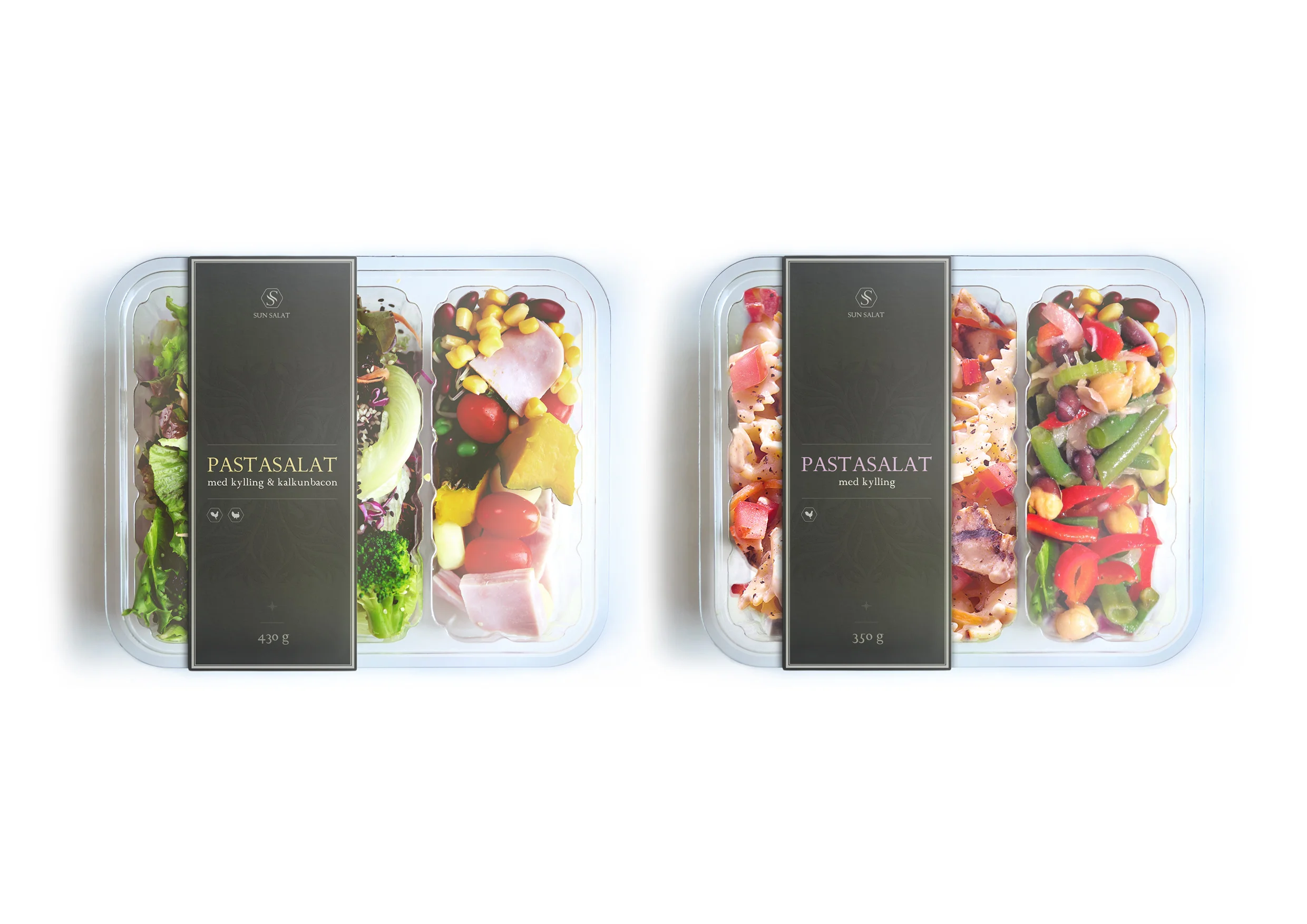
Sun Salat is a leading Swedish brand specializing in packaged meals, including salads, dips, sandwiches, fruits, and beverages. Their products are a staple in food aisles across Scandinavia, available in renowned retailers such as Irma, MENY, Føtex, 7-Eleven, Circle K, and Lagkagehuset. I first collaborated with Sun Salat over eight years ago, designing their initial logo, which has since become a recognizable symbol in the market.
In 2016, with their remarkable growth and expansion, Sun Salat approached me to refresh their visual identity and align it with their evolving brand. The goal was to maintain their core identity while elevating their brand presence to reflect their position as a market leader.
design approach:
The rebranding project involved creating a cohesive and modernized visual identity, encompassing:
Logo Refresh: Retaining the essence of the original design while introducing a sleeker and more contemporary look.
Business Collaterals: Designing business cards that project professionalism and brand consistency.
Product Labels: Developing premium, elegant packaging designs for salads, dips, and meals to stand out on supermarket shelves.
Marketing Materials: Designing banners, flags, and exhibition stands for retail and promotional events, ensuring consistency across touchpoints.
The updated visual identity incorporated refined typography, a neutral color palette, and subtle graphic elements to evoke quality and freshness. Each element was meticulously crafted to resonate with both existing and new customers.

outcome:
The refreshed identity helped solidify Sun Salat’s market presence and strengthened its reputation as a premium, accessible brand. The consistent and polished visuals across all materials not only enhanced brand recognition but also supported their continued growth and expansion into new markets.

web design: Ricoh Website Design
project overview:
Ricoh approached us with a clear vision: to create an online experience that reflects their circular philosophy, seamlessly integrating their approach to manufacturing, service applications, and sector-specific solutions. The objective was to design a digital interface that not only informs but also engages, showcasing Ricoh’s innovative solutions and commitment to sustainability.
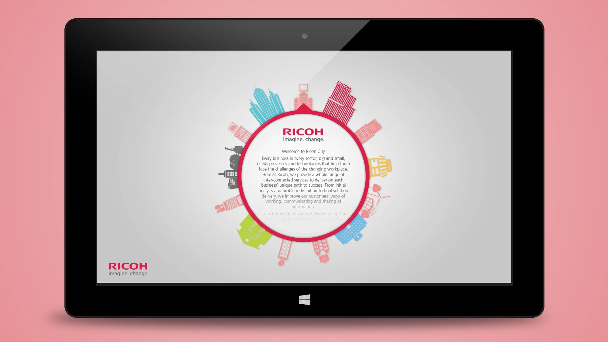

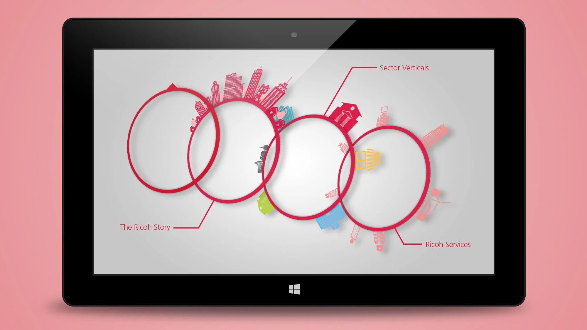
design approach:
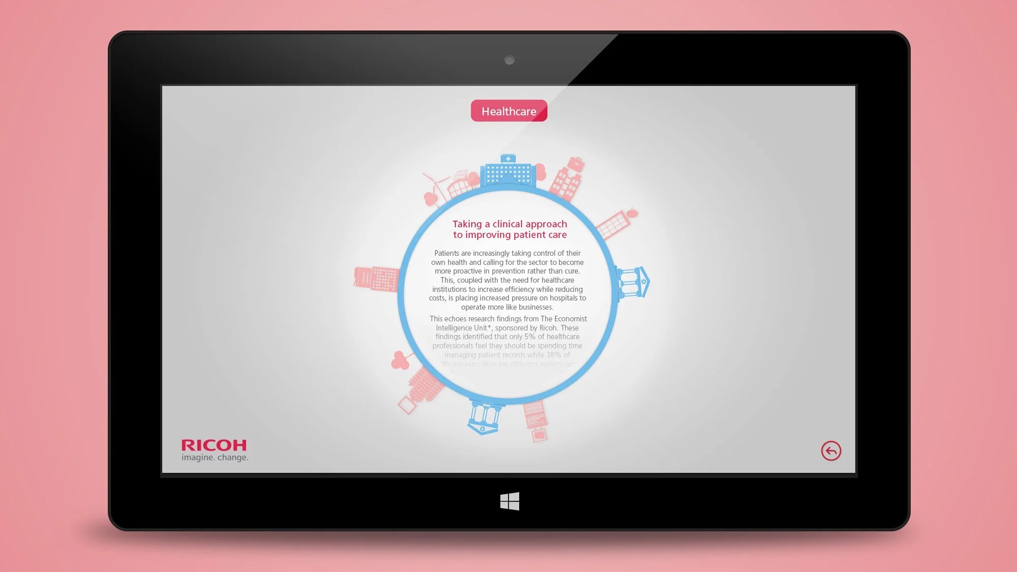
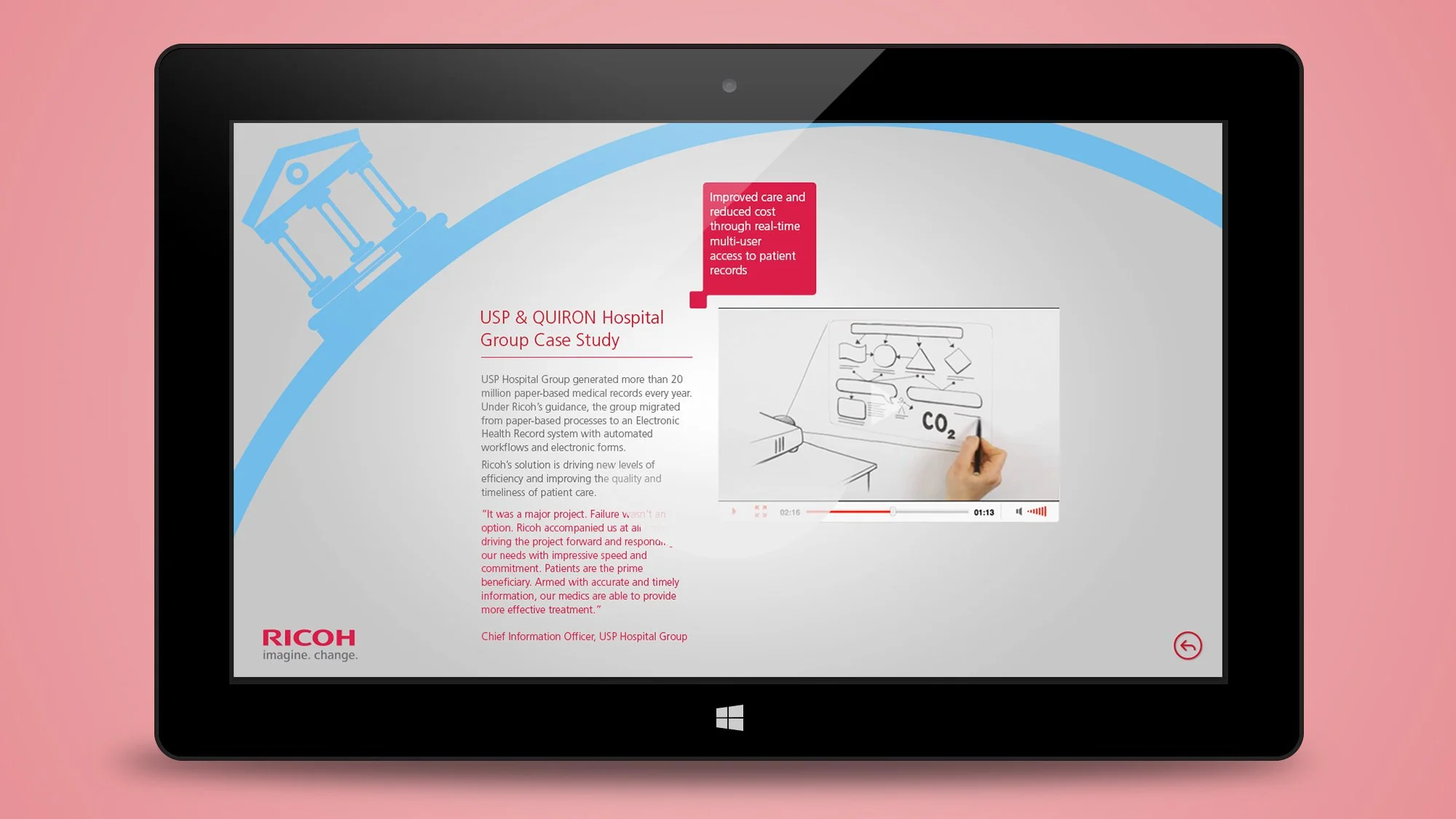
The design leverages a circular motif to echo Ricoh’s ethos of interconnectedness and innovation. Each element—be it the ‘Sector Verticals’ or ‘Ricoh Services’—is strategically placed to guide the user through a journey that illustrates Ricoh’s holistic perspective. The dynamic interface invites users to explore case studies, like the USP & QUIRON Hospital Group, to see real-world applications of Ricoh’s technology in action.
user engagement:
The interface combines visual storytelling with an intuitive layout to captivate the audience. Key features include interactive elements that delve into sector-specific insights, such as healthcare solutions focusing on patient care, and video content that highlights the impact of Ricoh’s initiatives.
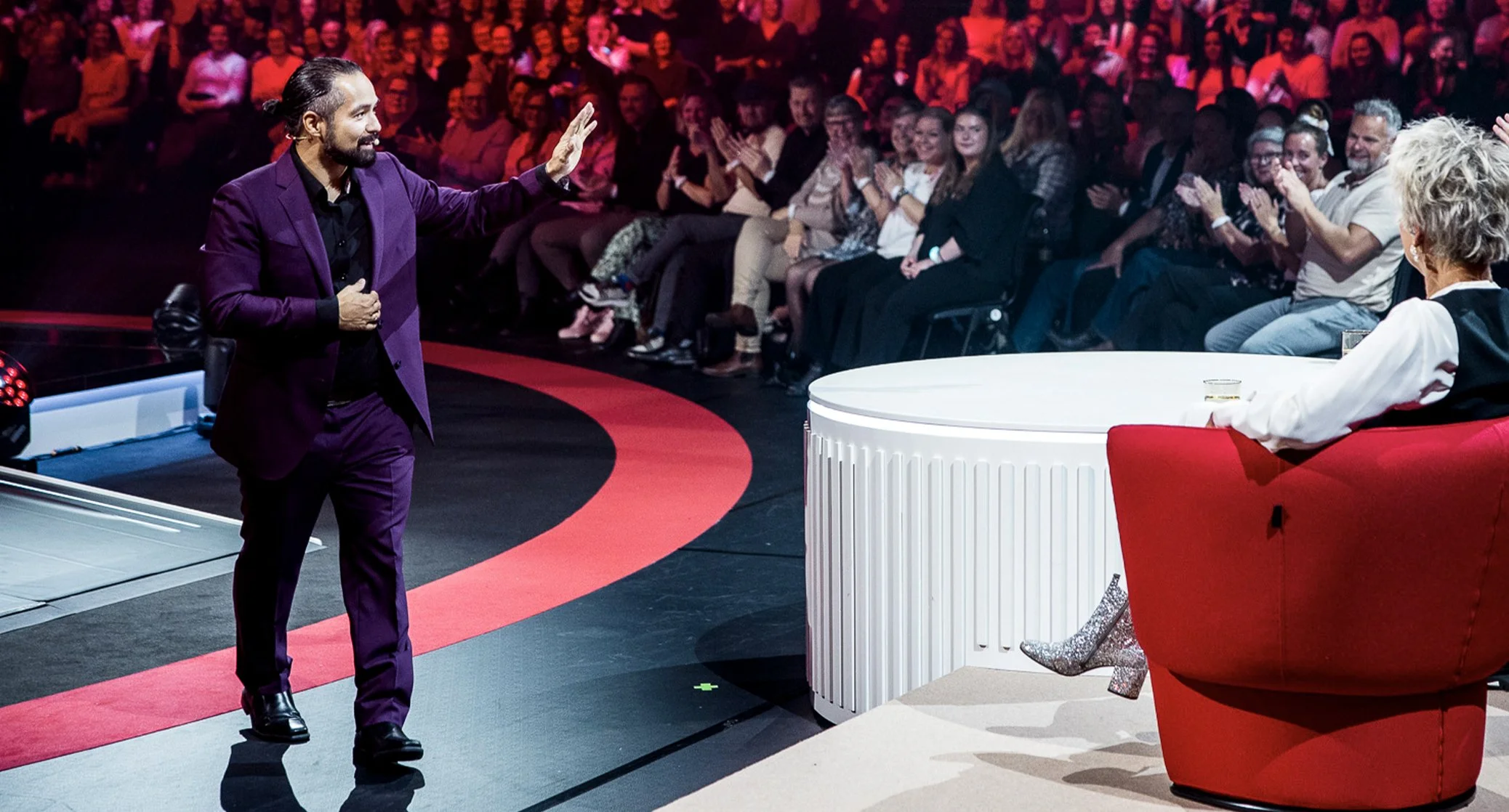
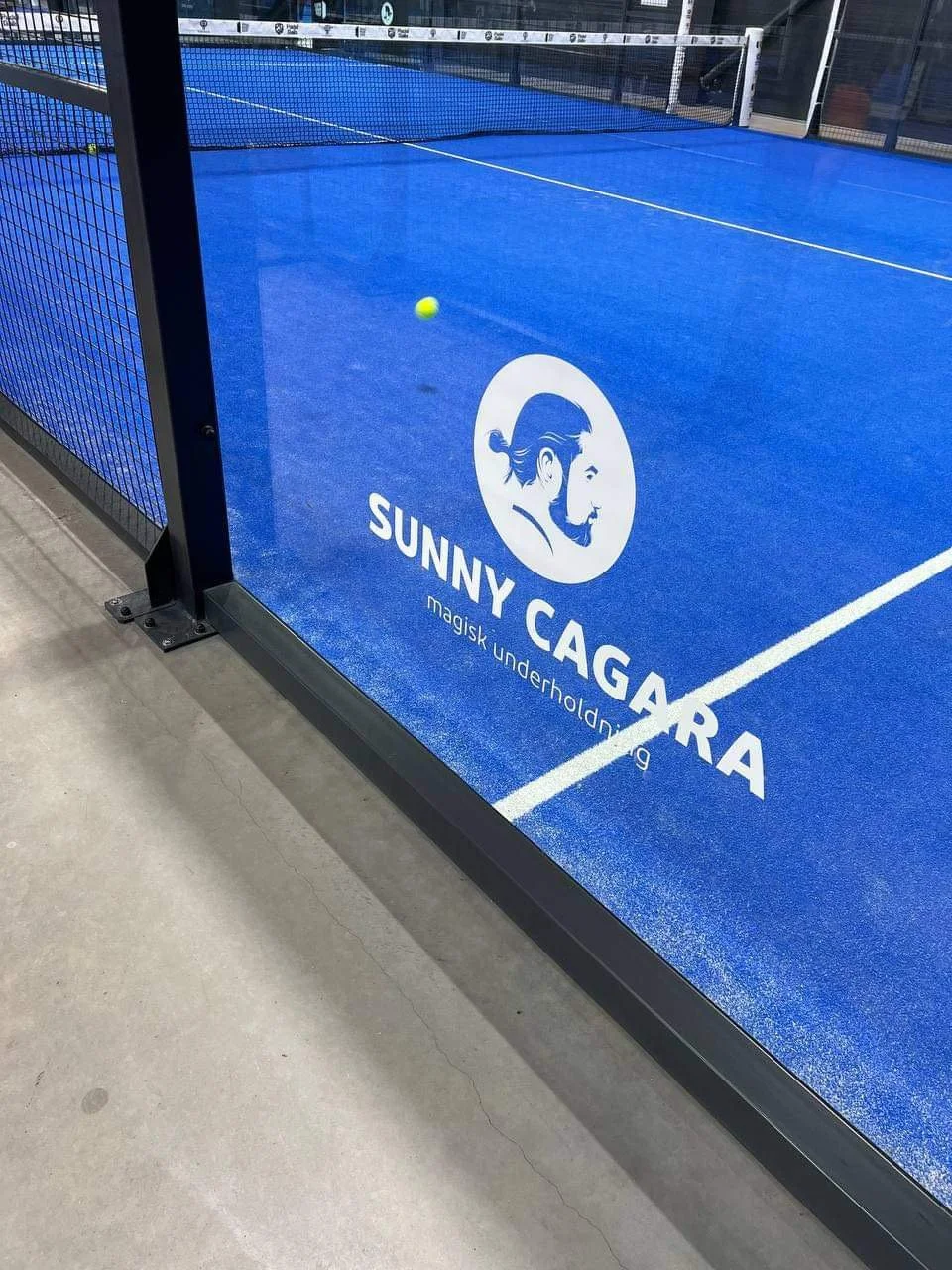
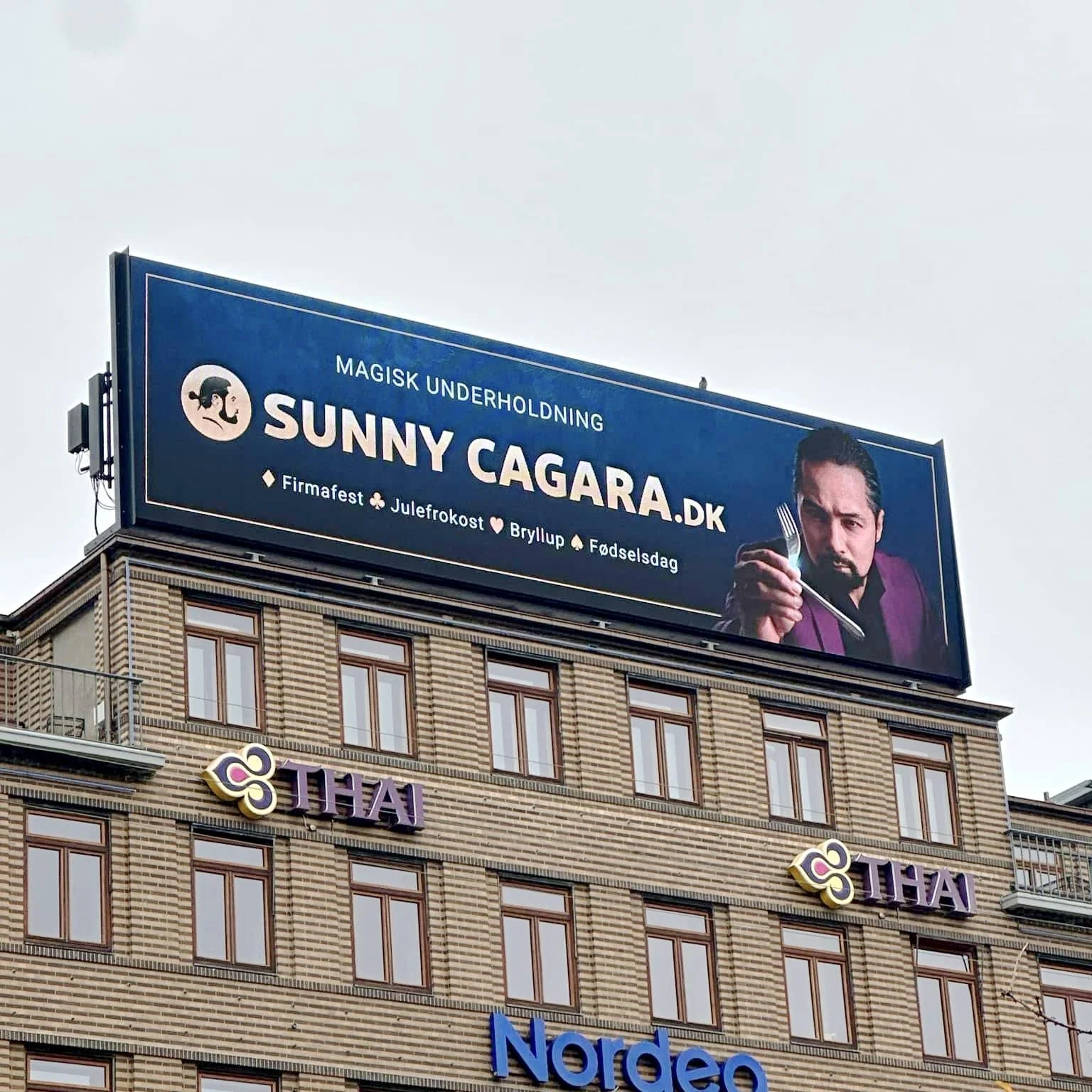
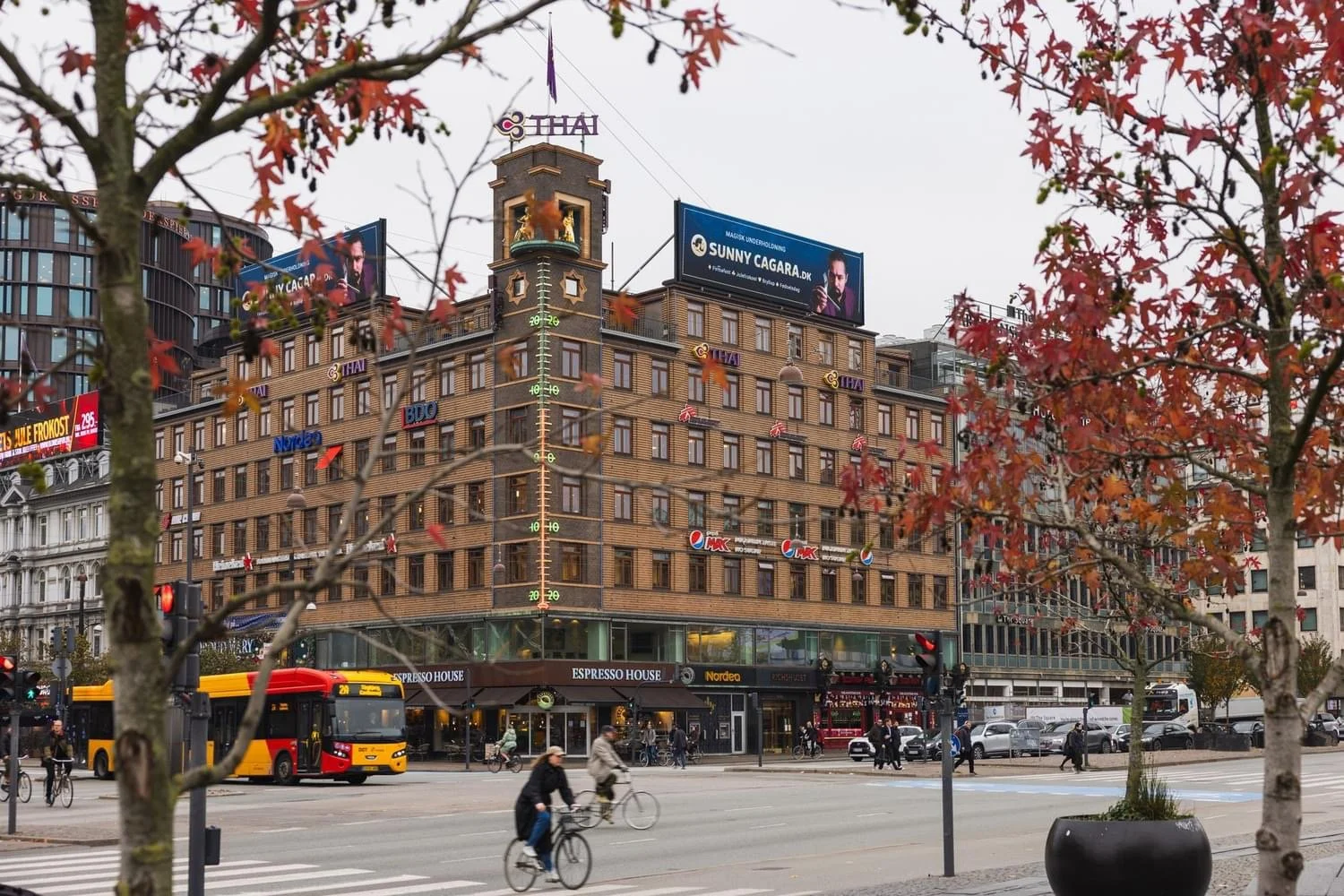
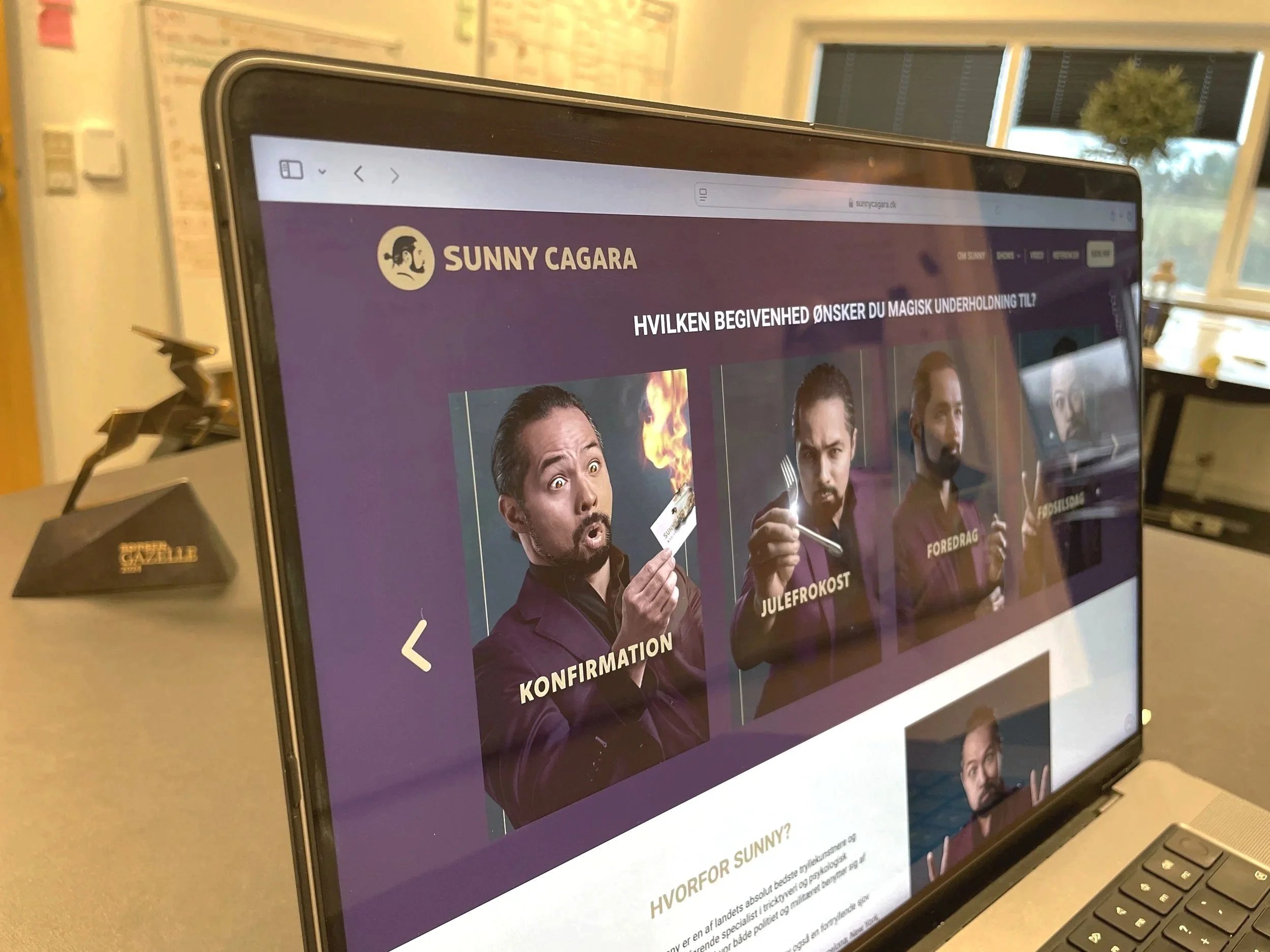
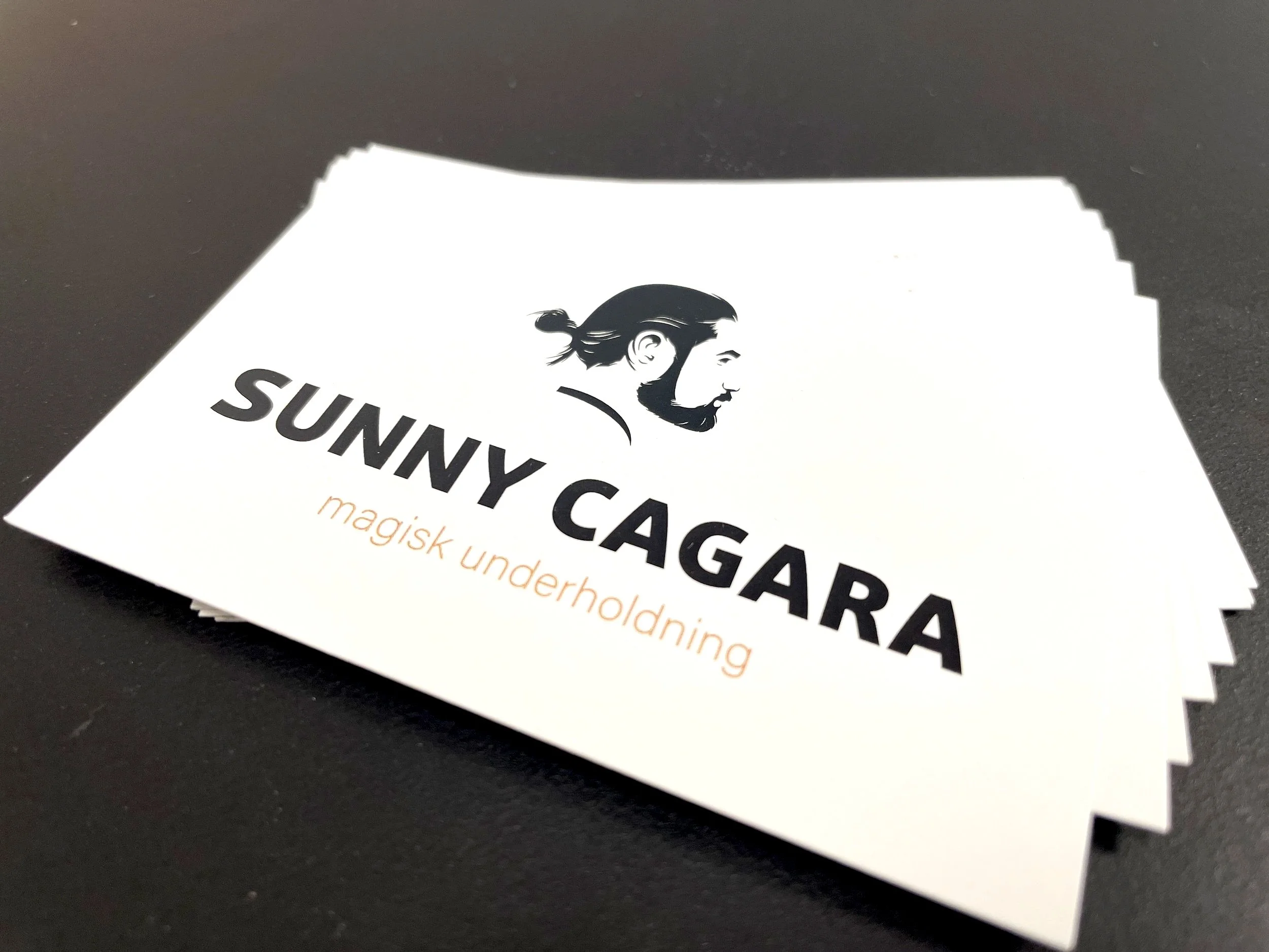
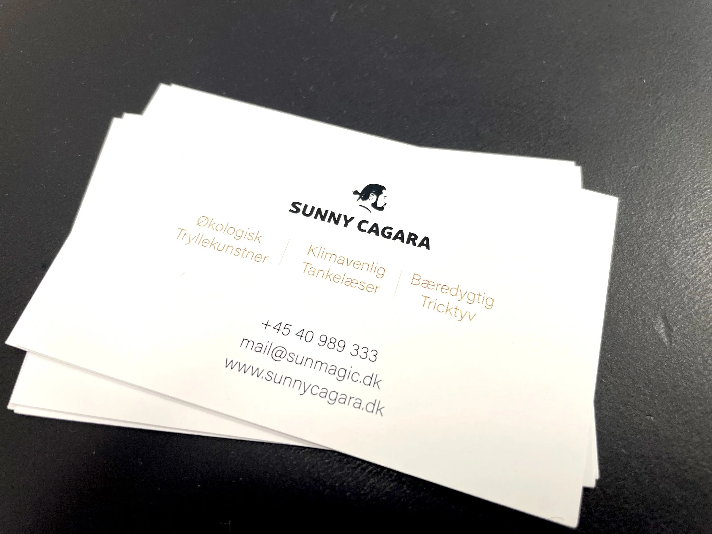
visual id: Sunny Cagara
Sunny Cagara needed a brand identity that could reflect his presence as a performer while working seamlessly across stage, street, print, and digital platforms.
The solution was to place Sunny at the very centre of the identity.
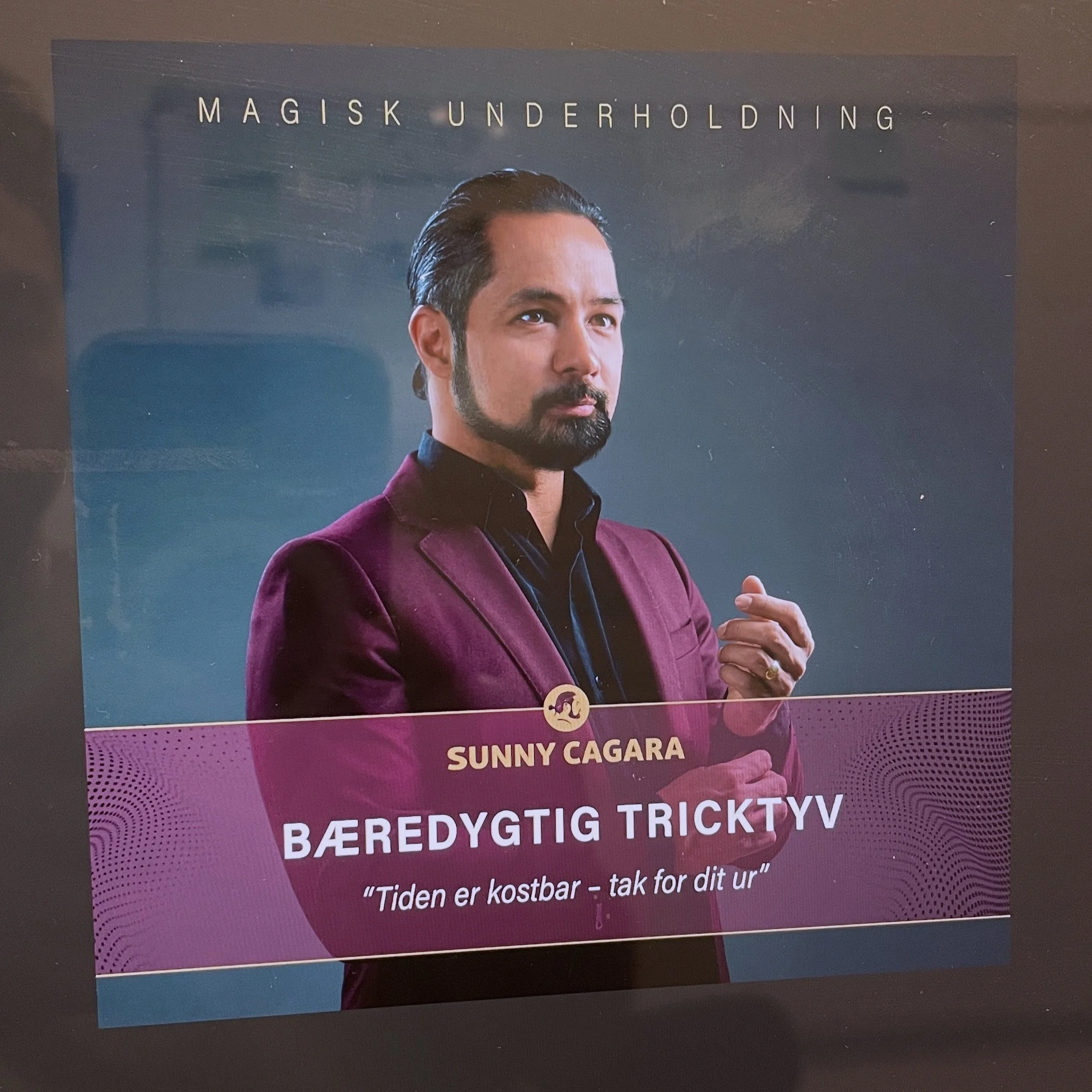
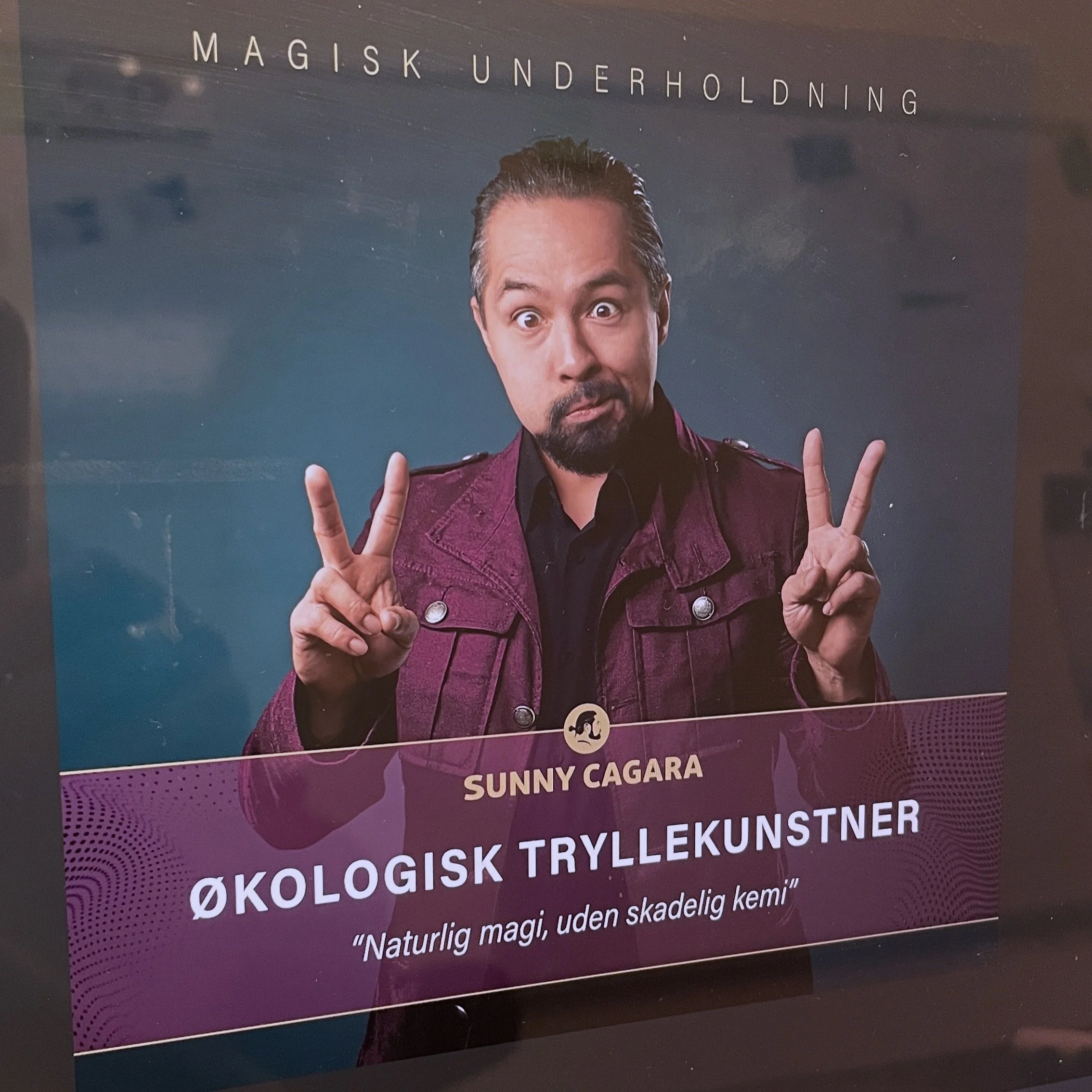
The logo is built from a simplified silhouette of his profile, turning the performer himself into the brand mark. Rather than relying on abstract symbols, the identity makes Sunny both the face and the foundation of the brand.
A deep purple colour palette runs consistently across all touchpoints, creating a strong and recognisable visual thread. The colour supports the sense of mystery, confidence, and theatricality that defines Sunny’s performances, while remaining clear and professional in execution.
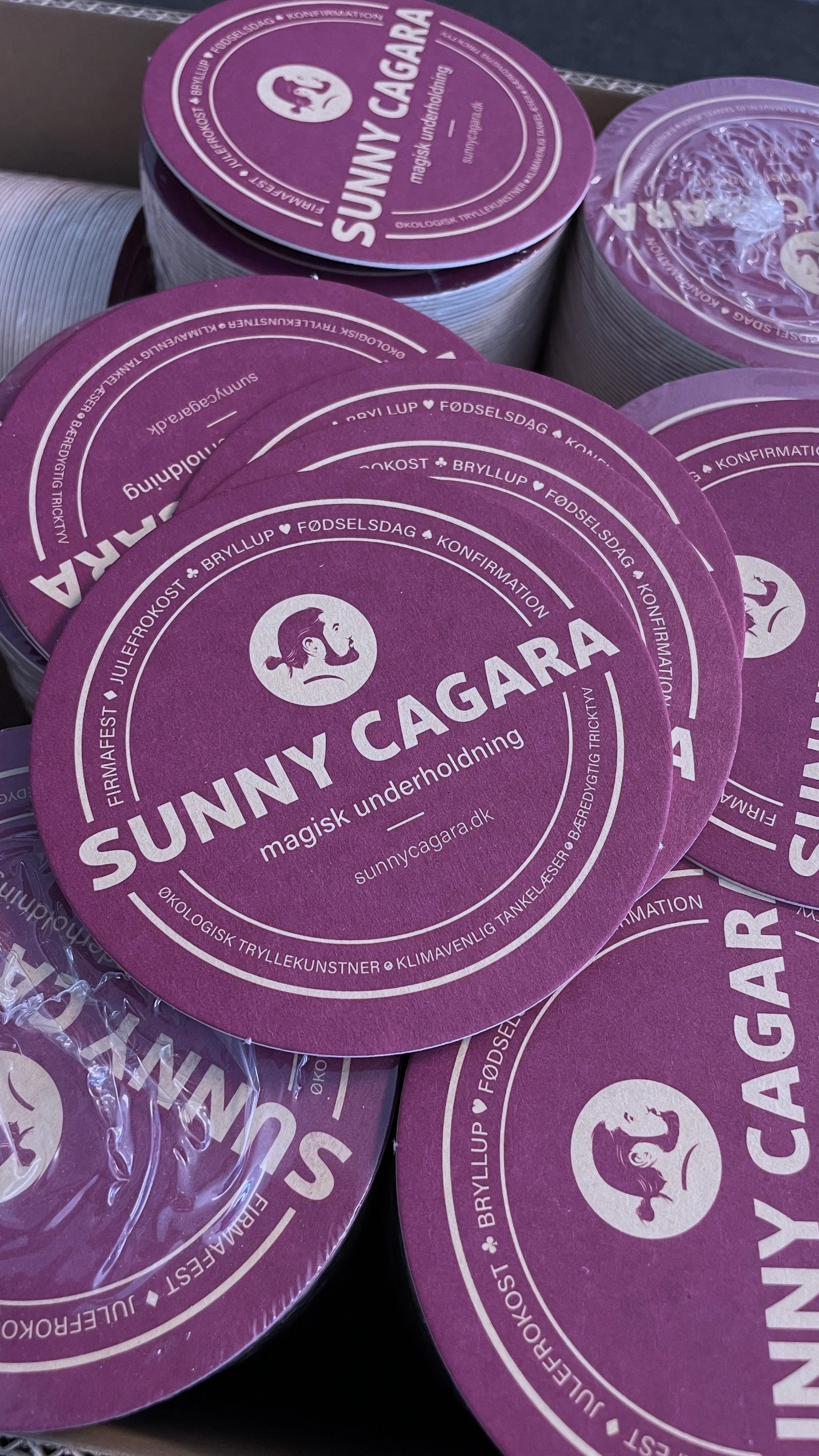

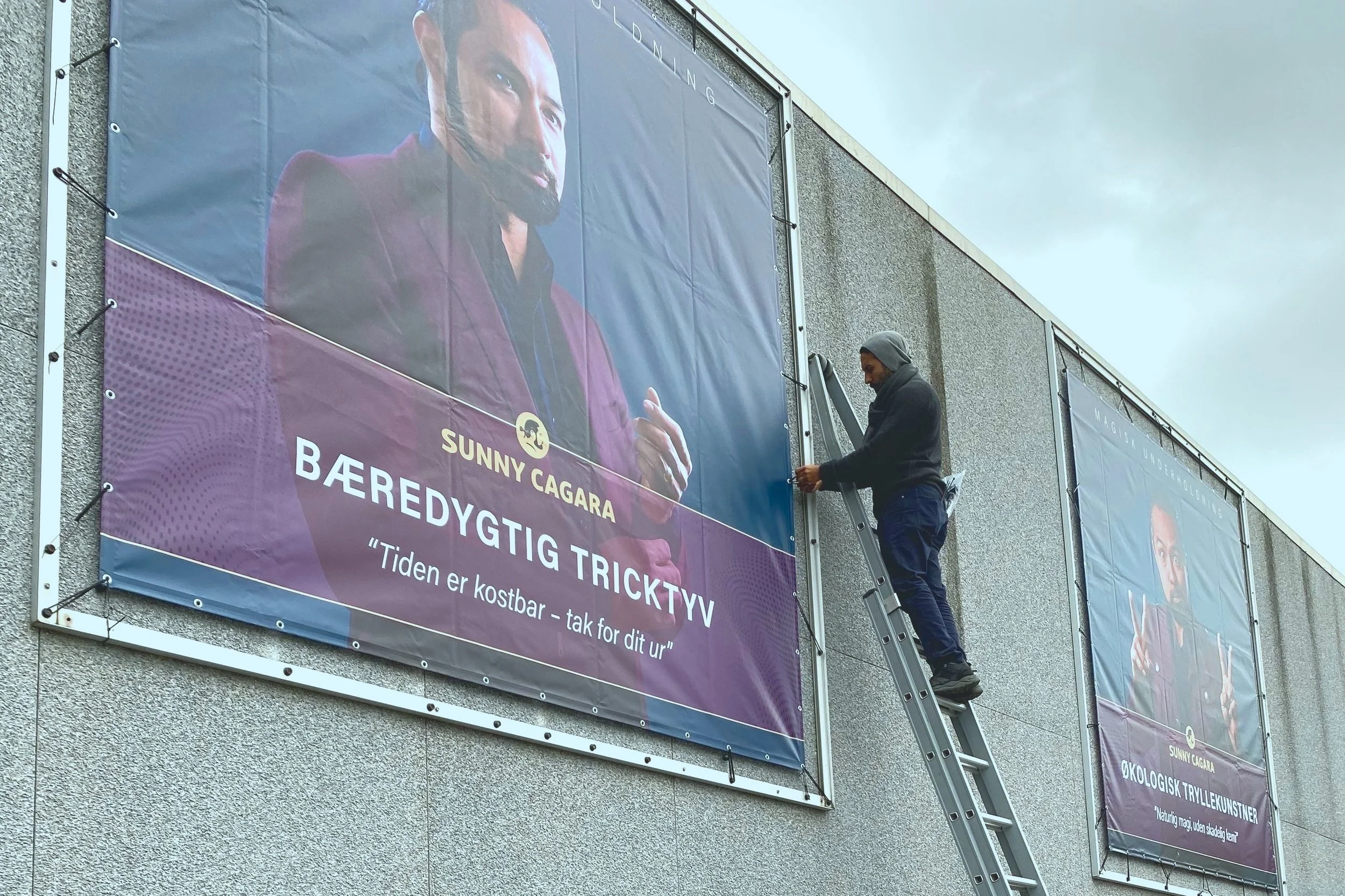
The identity system was designed to scale across:
live performances and stage settings
outdoor advertising and large-scale billboards
business cards and printed materials
website and digital booking experiences
Bold portrait photography, restrained typography, and a clear visual hierarchy ensure that the brand feels distinctive without becoming decorative. Each execution balances showmanship with clarity, allowing the personality to lead while the design holds everything together.
The result is a cohesive personal brand where the performer is the product, and every touchpoint reinforces the same confident, recognisable presence.